Printing—19th century style… Buffalo Bill’s posters – Points West Online
Originally published in Points West magazine
Summer 2014
By Mike Parker
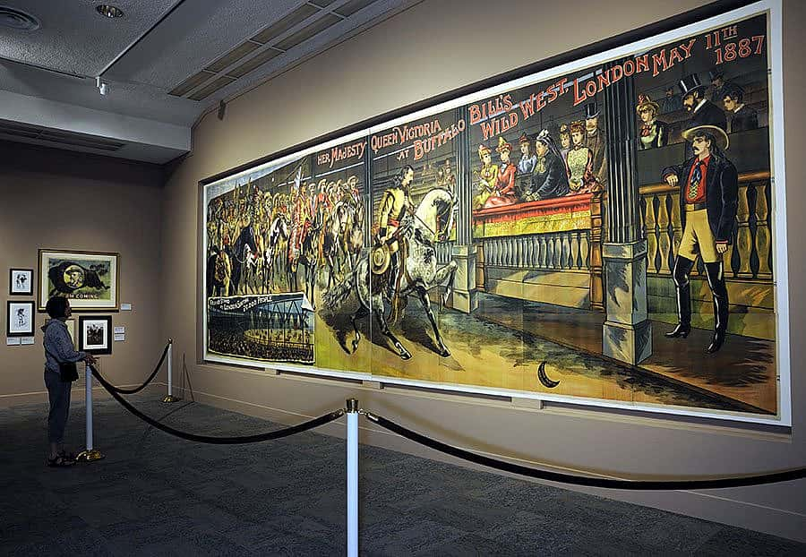
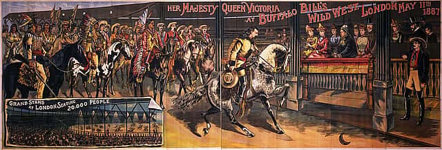
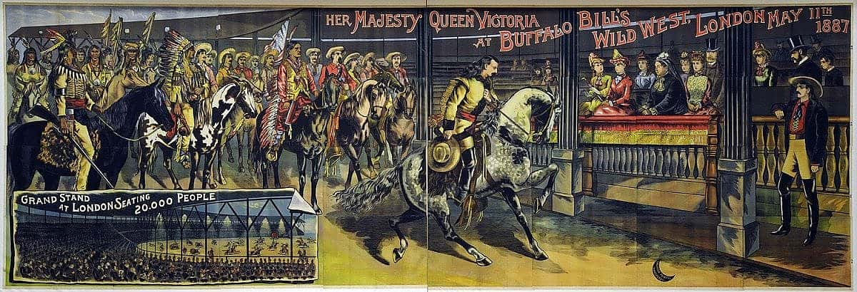
When the Buffalo Bill Center of the West acquired a poster commemorating an 1888 performance of Buffalo Bill’s Wild West show for Queen Victoria of England, it created quite a stir.
It’s impressive to see the 32-panel, 10 x 28 ft. poster on display in the Center’s Buffalo Bill Museum. As a printer, I’m even more taken by all the thought processes that combined to transfer an image created by the artist’s brush to multiple copies in printed form.
Turn with me now to those thrilling days of yesteryear when things moved slower, a dollar was worth more, and hand craftsmanship was in flower.
The “who”: Calhoun Steam Printing Company—poised to print the Wild West
Printing is a capital-intensive business. It takes a great deal of money to keep a printing company running, but you will never find a more optimistic businessman than a printer. As a result, a printer is constantly on the lookout for a specialty to keep the presses running.
Calhoun Steam Printing Company of Hartford, Connecticut, specialized in printing circus and carnival posters. Several from 1850 – 1855 show examples of this area of expertise. One poster, 8 x 17.75 in., highlights “Splendid Amusements,” featuring a Mr. A. Walker. A second, an 8.25 x 18 in. sheet, ca. 1855, boldly announces “Nose Amputation! Large Noses Preferred.” A third poster advertises a “traveling amusement show” (circus) and is 9 x 22 in. These posters are examples of the busy carnival season roughly spanning mid-June through mid-September. Their sizes suggest a job press capable of handling a 14 x 20 in. press sheet—a fact to remember as we move along.
When you have a shop full of 200–300 type cases of text and display wood type—a typical assortment of the day—and printer’s devil’s men (apprentices) standing around, you have to take on more jobs. So, the Calhoun Company also printed clock labels. Their labels were found on the backs of clocks by J.C. Brown, ca. 1849; Chauncey Goodrich, 1854–1856; Forestville Clock Co; and Elias Ingraham & Co.
Finally, Calhoun also printed books. As an example, an antique bookseller advertises an 1859 20-page bound book by C.A.G. Brigham titled Christ Came to Save Sinners! a Sermon. This indicates a handset-composed book, printed quarto (eight pages of text on a sheet, four on each side, and then folded twice and stitched to form a book or pamphlet) with a press sheet size of 12.5 x 19 in. on a 14 x 20 in. job press. While there is no mention as to the number of copies, several hundred would be a safe assumption.
The “how”: water, steam, treadle
Rivers were sources of machine power before and during the Civil War. Water wheels turned shafts mounted in the ceilings of industrial buildings, which in turn powered belts that ran pulleys on machinery. Then, supervisors would send children up to the ceilings to dress the belts and grease bearings mounted on the shafts, giving rise to the term “grease monkey.”
Large presses required steam, and steam-operated presses were invented in Great Britain in 1815. As the demands for printed material grew during the Civil War, the adaptation of steam to power presses was a natural, but not necessarily easy. The weight of steam-driven presses required a stout building to support a machine weighing up to 10,000 lb.
On the other hand, job presses did not require power. They could be operated by a foot treadle similar to a sewing machine.
The “what”: a Hoe printing press
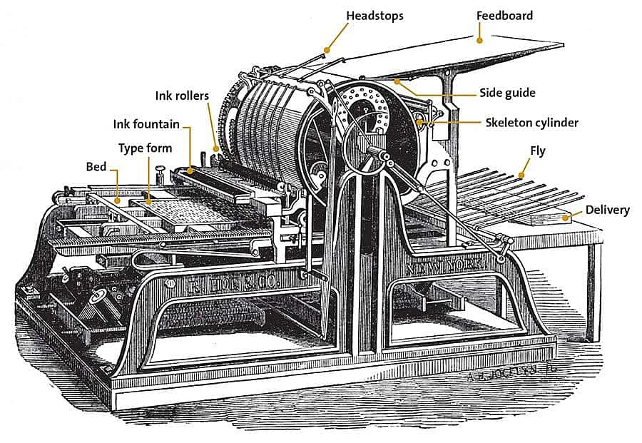
A steam press printed the Queen Victoria poster. The Calhoun Steam Printing Company’s press was probably a Hoe, designed by Richard March Hoe. This was a one-cylinder printing press, and Hoe was the first machinist to employ steam as a motor. In the trade, it is known as a “flatbed cylinder press,” i.e., a flatbed holds the type while the paper is attached to the cylinder and rolled over the type for the impression.
The flatbed press uses five systems, or processes: feeding, registration, printing, inking, and delivery.
1. The pressman stands on the deck to hand feed each sheet. He fans the paper and lays it on the feed board, a large surface sloping to the cylinder. The pressman takes the tail of the sheet and gives it a slight “lifting flip” to float it down to the head stops.
2. He aligns the sheet to the side guide for registration, which ensures that each sheet will have the image printed in the same position and in the same relation to previous images.
3. As the cylinder rotates, gripper fingers grab the sheet, take it from the headstops, hold it in position, and help the sheet conform to the curvature of the cylinder. The purpose of the cylinder is to transfer the image from the type to the paper; thus, the cylinder is half the printing system. The other half of the printing system is the flatbed that holds the type. This method of printing is called “letterpress,” which is executed from a raised or relief surface. The surface from which we print is called the “form,” and it is locked into the bed of the press. The bed reciprocates back and forth under the cylinder using hundreds of pounds of pressure to transfer the image to the paper. As the bed moves, it picks up two charges of ink: one charge out of the printing nip and a second charge on the way back to the nip and image transfer. Here, the pressman had to be careful to monitor the settings of the ink fountain so he didn’t put down too much.
4. As the flatbed reciprocates, it passes under the inking system of the press. The ink rollers, made of metal and composite material, are located near the cylinder and just above the bed. The process alternates between the metal roller and the composite roller (fabricated of ink-receptive sawdust and molasses) to dissipate heat and to assure the ink is milled to a thin film. Not only do the rollers turn, they also oscillate side to side for good ink distribution.
The ink mixture of the day was linseed oil and varnish ink mixtures. Black ink was linseed oil, varnish, and carbon black. Red ink was a mixture of linseed oil, varnish, and iron. Many inks had secret formulas for colors and were commonly called Dragon’s Blood. Keep in mind that the inks of the 1880s were not ultraviolet light-stabilized and would fade when exposed to sunlight. These inks are called “fugitives.”
5. After the sheet was printed, the sheet then went to the delivery. On the Hoe press, there was a skeleton cylinder that moved the sheet to vertical, wooden fingers that would flip the sheet, blank side up, on a table.
You do the math
As I mentioned earlier, the Queen Victoria poster is the result of letterpress printing. Instead of type, though, the printing surface is a raised or relief image; anything not printed must be cut away. For that reason, any time one prints from the printing surface, it has to be in the negative orientation. We printers learned long ago to look at things upside down and backward. Take a look at the poster, and try to visualize every element upside down and backward! Even more, think of the engraver who created the relief surface!
In letterpress printing, we have a term called “type high,” which means “as high as the standard height of type,” i.e. a measurement of the distance from the bed of the press to the top of the printing surface. The U.S. type high is .918 in.; much more than this and the printer runs the risk of damaging the type or the press. Less than .918 in., no image prints. Consequently, it’s critical to maintain the type high measurement. The engraver couldn’t cut too little or too much.
Look closely to see that the poster consists of 32 separate sheets! Since four base blocks were needed for each of the four colors for each sheet, a total of 512 base blocks (4 blocks x 4 colors x 32 sheets) were needed to produce this poster! All told, this poster was the compilation of 763 blocks of wood, the Center has learned.
To build the form to hold the blocks, the printer would have to consider several things.
1. Base material. Typically, printers of the day used grain-end hardwood to make the base. They had to use extreme care in the choice of hardwood because of expansion due to humidity. They preferred maple, but it was expensive.
2. Expense. One of Calhoun Steam Printing Company’s competitors, a company named Strathmore who also printed carnival-type posters, made their base out of grain-end pine. It was much less expensive, so it was a good choice.
3. Impact resistance. Ingrain offers impact resistance. Flatbed cylinder presses transfer the image to paper at the rate of up to 1,000 lb. of pressure per square in.
4. Attainable. Workers took planed, pine lumber two-by-fours and crosscut them at one-inch intervals. They glued the multiple pieces to a block approximately 22 in. long x 11 in. wide x 1 in. thick. Then, the block was cut to precise dimension, sent to a milling machine, and milled to .793 in. thick. The maximum image possible with this poster is 20 x 40 in., so it was necessary to cut and mill four grain-end bases per color. When you look at the poster, you can see where the four groups of base blocks align. This poster was printed in four color, i.e. red, blue, yellow, and black.
Engravers on the job
While the machine shop was busy, the poster’s designer, the composing stone hands, and the engravers worked on individual components of the poster. As mentioned before, instead of type, workers carved images into the blocks.
Wood engraving dates back to the time of Gutenberg. At that time, these workers were called block carvers. They determined that fruitwoods were the best due to the tight grain; and since they carved against the grain, pear wood was one of the best. On the other hand, European carvers also learned that fruit trees produce small surfaces.
Here in America, wood engravers decided that veneer woods from beech trees worked well. The wood had a tight grain, and when it was coated with oil, it had an excellent ink affinity. Veneers were cut to 1/8 in. (.125), which, when added to.793 in. base blocks, equals our desired type high, .918 in.
Remember, the pressman can only print the color ink that is on the press. If he prints black and wants gray, he has to apply tinting, a job for the engraver who cuts a solid area of the veneer using fine lines. If the tint is to be darker, the lines are thicker; if the tint is light, the lines are cut thinner. In the case of this poster, which is printed in four-color, we have more to consider—like optical illusion. For the tinting to work in four-color, and to gain maximum light reflection for the illusion of color variation, we learned over the years to assign angles to the colors. To black tints, it’s 45 degrees; red tints, 75 degrees; yellow tints, 90 degrees; and to blue tint, 105 degrees.
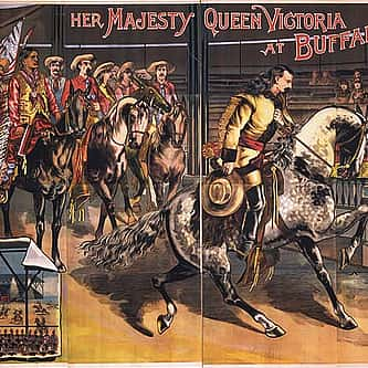
In the case of solid inks, fine-toothed marquetry saws were used to make these angled cuts. On the left side of the poster stands a black horse (above); if you look closely, you can see faint white showing around the horse. This is where the veneers don’t line up. A second solid that stands out is the red shirt worn by Chief Red Shirt(center). Many solid areas were handled by the marquetry saw, and once completed, the solid piece was then attached to the end-grain block base with pegs and glue. You can see evidence of such an attachment on the lower portion of the poster where a yellow tinted area cut at 90 degrees, and an overlapping tinted area of red cut at 75 degrees, give the illusion of orange color. Close examination also reveals small circular peg marks.
The engravers need only scratch a shallow amount of veneer to achieve the desired result of tinting. However, small areas such as found on a headdress or breast shield (left) were removed using miniature musical instrument planes to achieve the raised image. Thus, engravers used many tricks of the trade to create a raised image for printing.
Buffalo Bill’s white horse (above) would have had all the areas on the red, blue, and yellow printers removed. The black printer would have small areas of tinting cut at 45 degrees to show muscular definition.
The inset in the lower left corner of the poster is a true tribute to the engraver’s art. The white, solid reversed letters. The graphic diffusion using tinting of the spotlights. The minute carving of the individuals in the covered grandstands. There are no words to describe how this inset enhances the poster. My guess is that it would have taken at least a year to get this poster ready for the printing press.
With the 512 blocks from our basic “printer’s math” and the additional special carvings needed for unique areas, the 763 blocks mentioned earlier to create this poster could be a conservative number, in my estimation.
Time to advertise
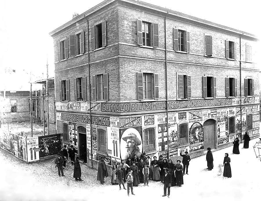
Scholars have indicated that about 125 copies of this poster were printed for a showing in the New York City area. “Poster gangs,” groups of people with territories in the city, distributed and installed posters at the best places where the largest numbers of passers-by would have seen them, such as the sides of large buildings.
To assure the poster was installed in proper order, a panel number was printed in the margin of each panel. The life expectancy of installation was a few weeks, and more than likely, wallpaper paste was used. The paper used for this poster was a Number 3 white poster paper with an approximate finish size of 20.5 x 40.5 in. The paper was such that it could withstand exposure to weather at least for awhile. Since posters of the day would eventually fade, finding a poster in such pristine condition is, quite frankly, almost inconceivable!
This Queen Victoria poster was printed a year after the Wild West’s 1887 performance for Her Majesty. History shows the printing of this poster was near the end of the Calhoun Steam Printing Company’s existence under that name. By 1890, it had become the Calhoun Photoengraving Company. Possibly this poster pointed a new direction for the company. Judging from the talent displayed in the production of this poster, the move should have been a good one. It is hard to fathom a poster of this size and quality sold for less than $10 per copy!
Today, at 66 State Street, Hartford, Connecticut, three blocks west of the Connecticut River, there is a plaza where an industrial building once stood that housed a 10,000 lb. steam-powered printing press—and produced history.
About the author
Mike Parker began his “printing career” as a 10-year-old delivering the Winfield Daily Courier in Winfield, Kansas. “I often had to wait for the paper to come off the press,” Parker says.”Finally, the foreman would ask ‘What do you want to know?’ I just told him, ‘I want to know what you know.'”
In high school, Parker read Ben Franklin’s autobiography, enrolled in graphic arts courses, and worked in the school’s print shop. He attended Kansas State College at Pittsburg with summers spent at small weekly papers. After graduation, he owned and operated a job printing shop in Powell, Wyoming, and taught classes at Northwest College. As a printer, and student of historical printing processes, Parker has presented numerous programs on the subject at the Center, especially related to the Babcock press that once printed the Cody Enterprise.
Post 077
Written By
Nancy McClure
Nancy now does Grants & Foundations Relations for the Center of the West's Development Department, but was formerly the Content Producer for the Center's Public Relations Department, where her work included writing and updating website content, publicizing events, copy editing, working with images, and producing the e-newsletter Western Wire. Her current job is seeking and applying for funding from government grants and private foundations. In her spare time, Nancy enjoys photography, reading, flower gardening, and playing the flute.
